Early 2000s Design Trends
Back in the early 2000s, websites were very plain and rectangular. Some were still quite grey too, which was a throwback to the 1990s when even colour was a bit rare to come by! Web programming was nowhere near as advanced as it is today; people had quite slow internet connections; and computer screens were relatively small; so therefore creativity in website design was pretty limited.
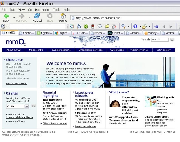
Take a look at the mmO2 website, for instance, pictured below. The design was positioned top left on the computer monitor and every available space used up. Notice how small the buttons are and also the lack of any bright colours.
 Late 2000s
Then came along the late 2000s and things became much more interesting. Bright, bold colours were introduced, especially colour gradients. Boxes instead became curvy shapes, with a rounded feel to everything. Social media became part of every day life and websites started to become more dynamic, rather than boring, static designs. More user interaction was sought, such as commenting facilities, voting, social bookmarking and more. Many popular websites introduced this “Web 2.0” style.
As the DropSend example shows, it has a bit more whitespace than in the earlier days, with bright colours competing for your attention and big, bold buttons.
Web Design Today
 In recent times, the curves and gradients are now disappearing, to be replaced with flat, single-colours and rectangular shapes. Nothing more highlights this shift in design than the new Windows 8 operating system, which has an eye-catching new Start menu featuring rectangles and block colours. The Windows Phone had also been launched with a tile-based interface, in much contrast to the Apple iOS and Android phone interfaces.
In fact, the new iOS 7 operating system for the iPhone (launching later this year) will also have a much flatter look.
For our new Primary Image website, launched at the start of 2013 (see this case study), we adopted this kind of style. Also, we designed a website for London mayoral candidate Christian Wolmar (read the case study), which again has a clean, boxed feel.
Admittedly not all websites will use a tile-based design, and nor should they as it’s not appropriate in all scenarios, but certainly more websites are changing how they use colours and are introducing new, cleaner layouts.
How does your website look? Think it’s in need of a refresh? Our website developers are based in London and Southend-on-Sea – contact us for a chat!
Mike founded Primary Image in 2010. He specialises in the WordPress website platform and speaks regularly at national web design conferences. Mike became a member (MCIPR) of the Chartered Institute of Public Relations in 2015.