
 Last Monday, TSB became Britain’s eighth biggest high street bank, marking a return to the standalone TSB brand for the first time in eighteen years since it was merged with Lloyds.
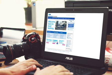
However, its new website (www.tsb.co.uk) has to be one of the worst examples I’ve seen in a long time and – quite frankly – is embarrassing for such a large company.
As the BBC reported a few days ago, the new website was hit by loading problems on its first day of operation. Having taken a look at the website, that’s not the only issue they should be concerned about:
- There was a prominent spelling mistake on the home page for the first few days (“youself” rather than “yourself”).
- It seems designed for a 800×600 pixel screen resolution, something that seems a throwback to the early 2000s! The whole site is also left-aligned, which looks awful on modern computer monitors.
- TSB doesn’t have a mobile-friendly site, which is expected nowadays for most websites. On the iPhone, a large white gap also appears on the right-hand side.
- The TSB Business Banking landing page has a large area saved as an image, so the links aren’t clickable, making it unusable.
- Also some other links don’t work – for instance clicking on the “Club, Charity & Society” account from the Business Banking page tells visitors that the page “could not be found”. A bit of testing should have resolved these basic errors.
- The TSB logo displayed in a really low quality for the first few days (now fixed), but several other images are still looking quite speckled and not particularly sharp.
- Optimising the images could cut the page loading times – most images are saved as a JPEG when they would be better served as a PNG (not only to cut the file sizes, but also to improve the image quality). This is basic web design! The website currently has a Google Page Speed test rank of 48%, which is seen as pretty poor.
- In terms of the aesthetics, things don’t line up nicely at all and it looks crowded in places.
With five million customers, surely they deserve something a little better than this basic and amateur website. With a reported £30m spent on the Lloyds Bank / TSB rebranding process, they might have wanted to put a bit more focus on their internet presence.
Come on TSB, you might have been gone for eighteen years, but the web has moved on since then and you can do better than this!
Update April 2018: So it’s been a very (very!) long time since I last looked at the TSB website, but I’ve just had a quick browse… On first impressions, it’s not great! The TSB website looks fairly basic and it’s not a particularly refined design. Plus, (my red highlighting) it’s telling users some parts of their service will be unavailable most of the weekend (not that users typically do any online banking on weekends!!). Oh dear…

Mike founded Primary Image in 2010. He specialises in the WordPress website platform and speaks regularly at national web design conferences. Mike became a member (MCIPR) of the Chartered Institute of Public Relations in 2015.
Comments
Update – it seems that Justin Williams has unearthed evidence that the “new” TSB website is actually a re-skinned version of the old Lloyds TSB website from 2009: http://www.d4online.com/blog/2013/09/tsb-and-other-rubbish-rebrands
This website is so bad it’s an embarrassment.
It is like telly tubbies all over again